Apartment Index
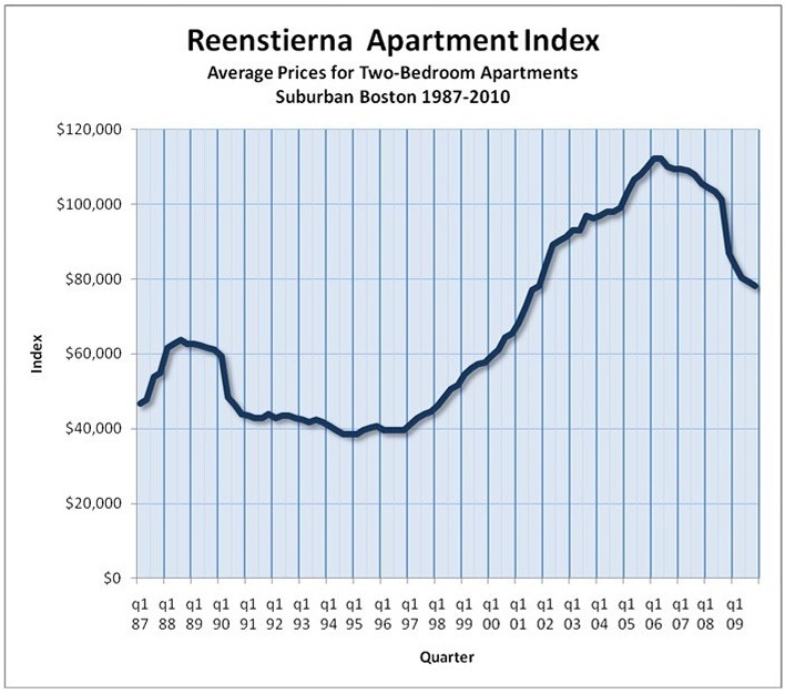
This issue of the Reenstierna Associates’ Report introduces the
Reenstierna Apartment Index. The index uses sale and resale data
to track the average price of apartments in the Greater Boston suburban
ring from 1987 to 2010. It is shown as a chart. The
February, 2010 version of the chart is displayed here. Later
versions may be found by way of the “Index” tab on the top
bar of the Reenstierna Associates’ home page or by clicking on
this link.

A few words about what the chart shows are useful.
The most striking features are the two price peaks that were reached in
1988 and in 2006. Each of these was preceded by a strong run-up
– in the case of the 2006 peak, over a period of seven to eight
years. Each was followed by a sharp, one-year decline. The
chart confirms what we knew in a general way for fact. But it
provides better detail. The 1989 decline reduced prices by about
35% from the 1988 peak. The 2008-2009 decline by early 2010 has
reduced prices by 30%. If history is a guide to the future, we
would say that, in 2010, a leveling of prices appears likely for a
period of ten years, to be followed by a price run-up of seven years, a
two-year peak, and another sharp decline.
The
Reenstierna Apartment Index, like indexes for the stock market or for
the price of gold, allows us to track the success or failure of
investments in this market made at various entrance and exit
points. Setting aside the net income earned by an apartment
building from annual cash flows (a feature not available from
investments in gold) and measuring strictly on the basis of price
changes, we can say that all-cash, unleveraged investments in suburban
Boston apartments on average produced these results:
• a doubling of price for a building bought in 1999 and sold in 2005
• a tripling of price for a building bought in 1994 and sold in 2005
• a loss of 30% of price for a building bought in 2006 and sold in 2009
Leverage through collateralized loans, more available for real estate
than for most other competitive forms of investment, magnifies these
results. An investment made at a 75% loan-to-value ratio in 1999
and sold in 2005 produced not a two-fold but a five-fold increase in
equity (30%, compounded, per year). The same investment made in
1994 and sold in 2005 produced a nine-fold increase in equity (22%,
compounded, per year). Conversely, for the 75% loan-to-value
investment made in 2006 and sold in 2009, the effect of leverage is
catastrophic, wiping out 100% of the equity, and more. The old
adage about real estate was “location, location,
location.” A better adage for recent decades might be
“timing, timing, timing.”
A few words are also useful about how the chart was created.
The source of the data is sales and resales of individual buildings of
four or more living units in the Greater Boston suburbs.
Buildings of three or fewer units are excluded, because these are often
partially owner-occupied. Owner-occupants have different
motivations from those of rental income investors, and inclusion of
small buildings could alter the graph. Buildings in urban
locations (the Back Bay, Chelsea, Somerville, or Lawrence) are
excluded. Some of these experienced an exaggerated price
“bubble” and a subsequent price decline of not 30% but 50%
in 2008. Others were affected by rent control and experienced a
price surge when rent control was abolished in the mid-1990s; inclusion
of these would produce abnormal readings. Buildings that
experienced foreclosure during the sale-and-resale period are
excluded. Foreclosure can be more than an economic event.
It may be accompanied by abandonment of the building, freezing, and
removal of pipes, systems, and kitchens, making the building very
different at any post-foreclosure sale from what it was before.
The process of data exclusion creates a chart that tells us something
about apartment prices in largely middle-income suburbs. An
equally valid chart could be created for lower-income cities. A
different chart could be created for the market of
three-families. A word of caution is in order. The suburban
apartment chart may be an inaccurate source of price change information
if applied to urban apartments or to three-families.
The process of data exclusion also results in a diminished number of
data points from which to derive the quarterly averages. Some
years (1996-1999 or 2005-2007) show a high volume of sales and a
relatively consistent picture, with small variation around the
average. Others (1990-1992) show few data points. Still
others (2001-2003) show a high volume of data points but greater
variation. The data line presents the best match between the data
points at any point in time. It is, however, somewhat
over-simplified. The line might be thought of as the center line
of a river. The center line of a river doesn’t entirely
describe the river. A river can also be described by its
banks. The “banks” of the river of data from which
this line graph are derived at some points broaden to 10% or more on
either side of the line.
This office will produce regular updates of this graph, on a quarterly basis, as the market continues to produce new data.
About Us
Eric Reenstierna Associates LLC is a real estate appraisal firm taking on valuation and consultation assignments in Greater Boston, Massachusetts and New England. Eric Reenstierna, MAI, is the office's principal and is a commercial real estate appraiser.
Explore
Contact
24 Thorndike Street
Cambridge, Massachusetts 02141
(617) 577-0096
ericreen@tiac.net
